Patterson Belknap Webb & Tyler LLP
Designing an Identity for a Legal Blog on Justice Ruth Bader Ginsburg


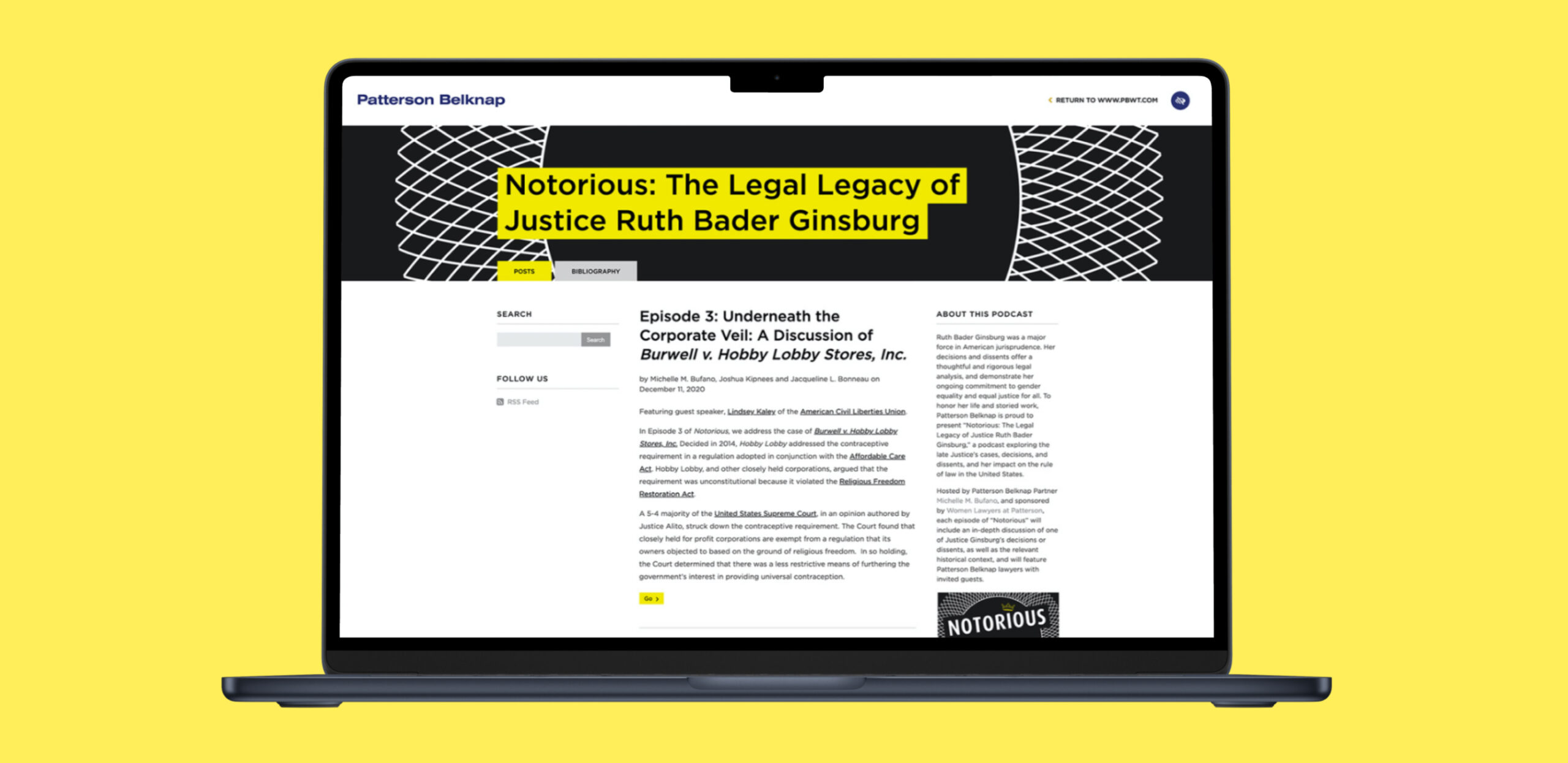
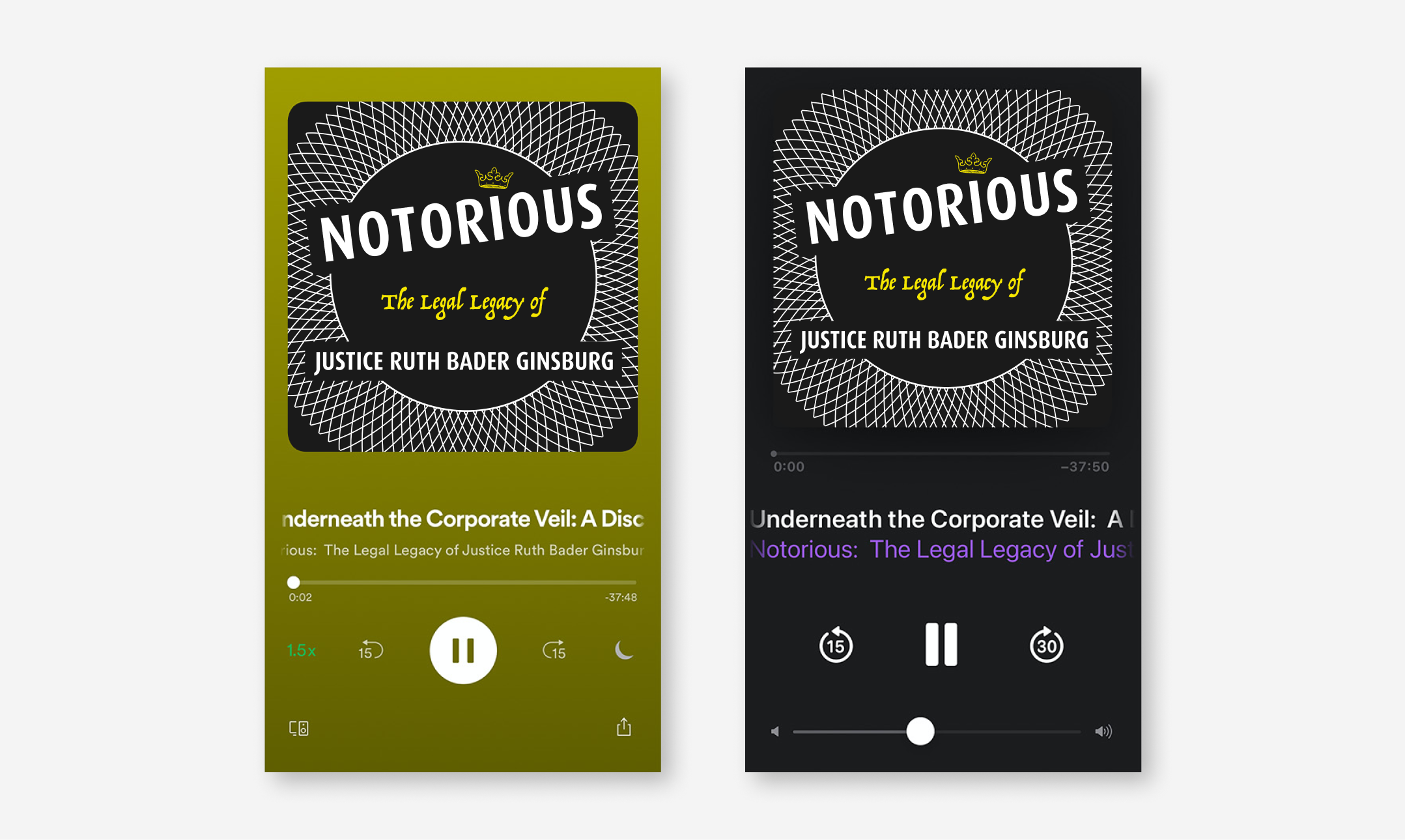
Patterson Belknap enlisted Knox Design Strategy to brand their new blog on the legal life and legacy of Justice Ruth Bader Ginsburg. Drawing inspiration from Justice Ginsburg’s collection of formal collars, we crafted a custom logo and graphic for use on their website and across podcast platforms.