Hart + Harvest Press
Branding and Web Design for a Book Publisher
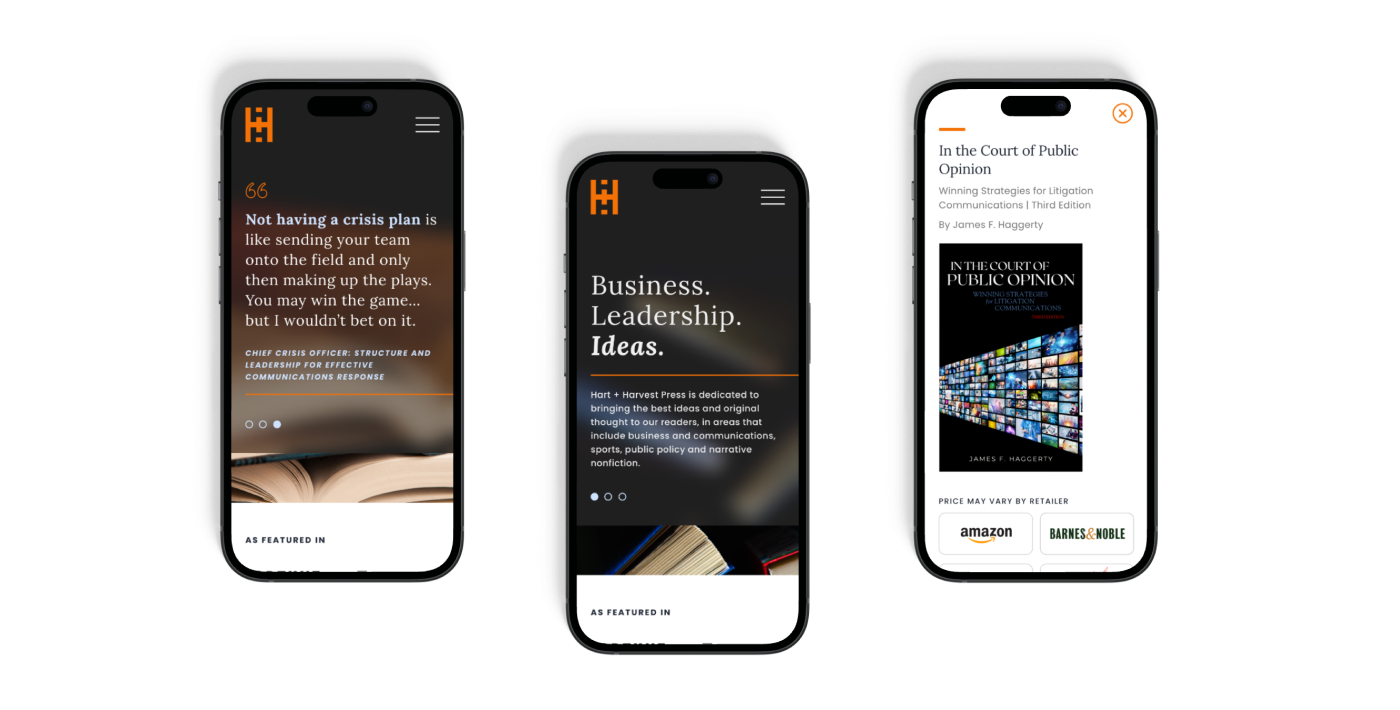
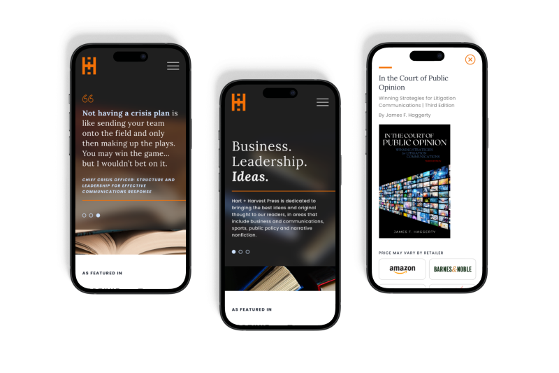
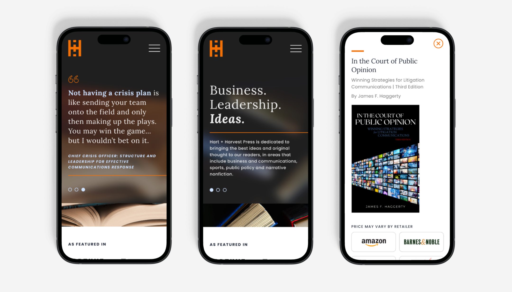
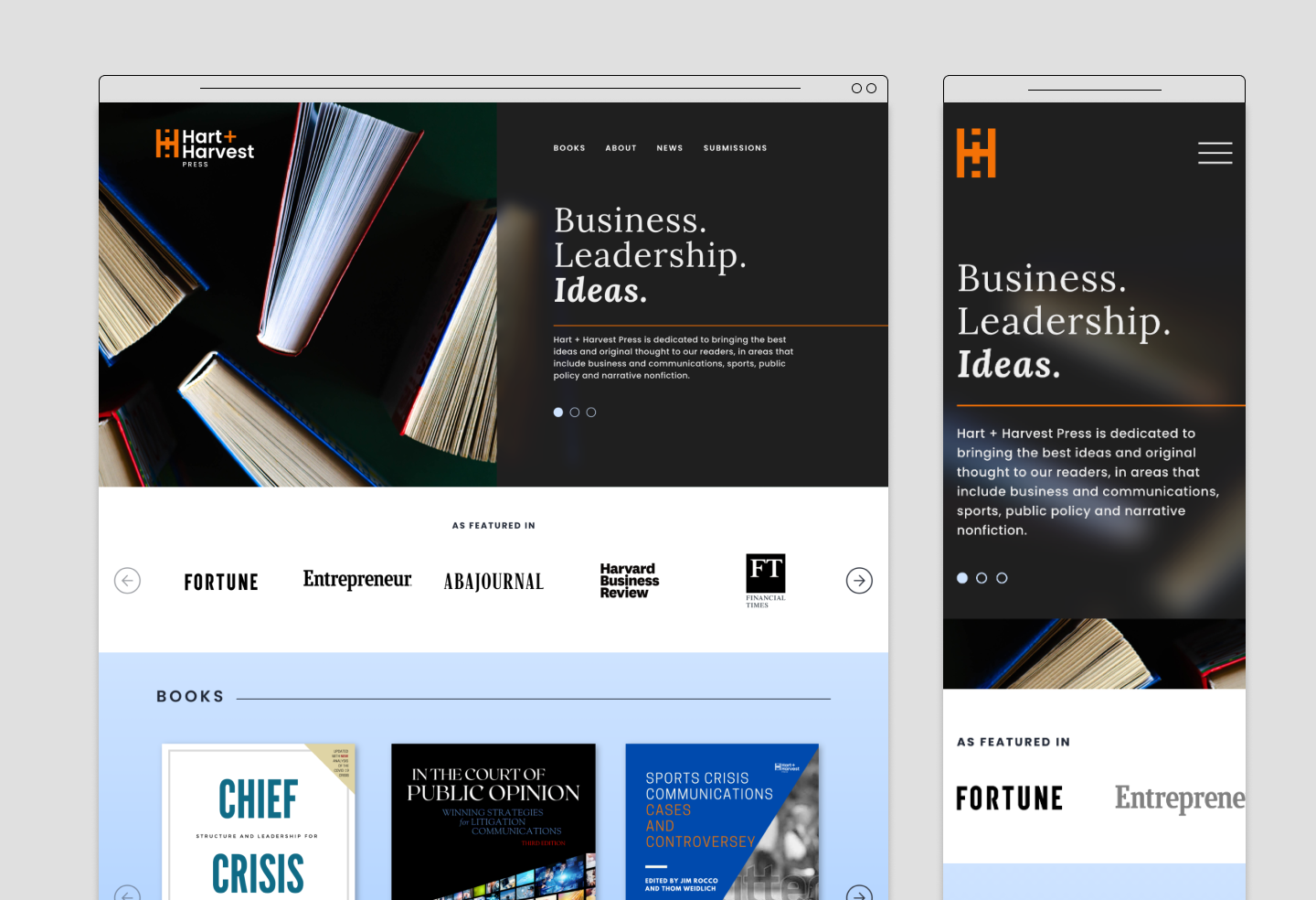
Knox Design Strategy worked along side the team at Hart + Harvest Press to create a logo and website. The branding process was inspired by the publisher’s unique name and origin. We collaborated with the team to provide concepts that resonate with the firm’s target audiences and connect viewers to purchase books. The website design leverages color blocks, layering, impactful typography and engaging literary imagery.
The concept of the logo was inspired by the name’s origin, derived from cross streets of a special location of the Hart + Harvest Press team. We used the double “H” letterforms to create an ownable and unique lockup for the monogram.
During the initial stage of the conceptual process, we identified unique shapes and lockups by sketching. The Knox Design Strategy team was inspired by bookshelves, aerial street views and connectivity. The logo incorporates two H’s in the negative space of an orange rectangle. The stacked lockup of the two H’s creates a ‘+’ to unify the H + H into Hart + Harvest. The mark can also be interpreted as a single H, an aerial view of cross streets, and as an abstract book shelf.