In the fast-paced world of digital product design and development, teams are under pressure to move faster while delivering consistent, high-quality experiences across platforms. Enter design tokens – a foundational system that’s transforming how teams maintain consistency and efficiency at scale. But what exactly are design tokens – and why should you care? In this article, Knox Design Strategy breaks down their purpose, how they’re used in real workflows, and why they’re key to bridging the gap between design and development.
Design tokens are the single source of truth for visual and functional design decisions – covering everything from colors and typography to spacing and elevation.
Picture a box of LEGO bricks. Every time you build something, you select specific shapes, sizes, and colors. Now imagine needing to change every red LEGO to blue:
Design tokens allow teams to stop relying on static specs and instead speak the same language – one that’s not only visible in design files but also mirrored in production code.
Unlike design variables that stay within design tools, tokens are exported into platform-agnostic formats like JSON and integrated into development environments. Engineers use these token files to apply consistent values – such as colors, spacing, or typography – across components, ensuring the final product aligns precisely with the design system.
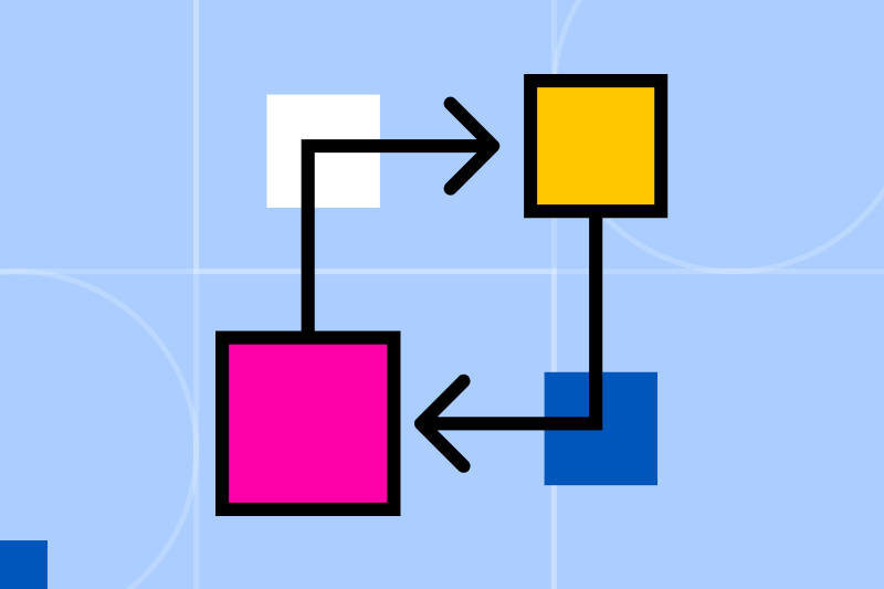
A common point of confusion: how do design tokens differ from components and variables?
primary-blue, body-large, or spacing-xl – that are used across design tools (such as Figma) and integrated directly into front-end code (such as CSS variables or JSON files in React or Vue projects).Tokens serve as the foundational source of truth. While components use these values under the hood, and variables in design tools may reference them, it’s the tokens that enable synchronized updates across both design and code. This system-level approach ensures changes are reflected consistently everywhere – without manual overrides or mismatches.
As tokens become the backbone of your design system, naming conventions become critical.
Each token name should be clear, concise, and scalable – for example, button.primary.background or text.heading.xl. A consistent naming structure reduces confusion, prevents errors, and makes onboarding and collaboration much smoother.
There’s flexibility here – some teams include themes, objects, or states – but what matters most is alignment and documentation across teams.
Figma’s built-in variables are a great starting point for storing values like colors, spacing, and typography. But for teams looking to scale, plugins like Token Studio unlock more power.
Token Studio enables direct export of tokens to platforms like GitHub, GitLab, Azure DevOps, or JSONBin – translating your design system into dev-ready code. This integration speeds up development, improves governance, and enables easy rollbacks and auditing.
Design tokens boost speed, consistency, and scalability – while helping teams avoid design debt and the pitfalls of time-consuming, error-prone handoffs. With a well-structured system, rolling out updates like brand refreshes or new themes can go from weeks to minutes.
Tokens also strengthen collaboration by giving design and development a shared, structured language. Even emerging tools – like AI-powered frameworks – can plug into token-based systems, driving even greater efficiency.
With design tokens, teams can:
Design tokens aren’t just a convenience – they’re essential infrastructure for any team serious about building modern, scalable digital experiences. Whether you’re starting small or scaling up, investing in a token-based system today means fewer headaches – and much smoother workflows – tomorrow.


